
Some final assets of the project
October 2024
MY IMPACT
Contributed most to the UX Research and UX/UI Design of the final product.
1
The Planning
On the first week of the project, our team got into contact with our stakeholder, the Director of the IT Department at LISA Academy to see if he had any concerns that we could address. He stated the following.
“Some potential changes we may consider are changes to streamline navigation, improving mobile responsiveness, and adding new interactive features to engage users even more effectively.”
This lead our team to begin investigating where the current navigation was lacking and how we might add interactive features, all of which would also be optimized for the mobile experience.
A video of the previous site that we were redesigning (2023)
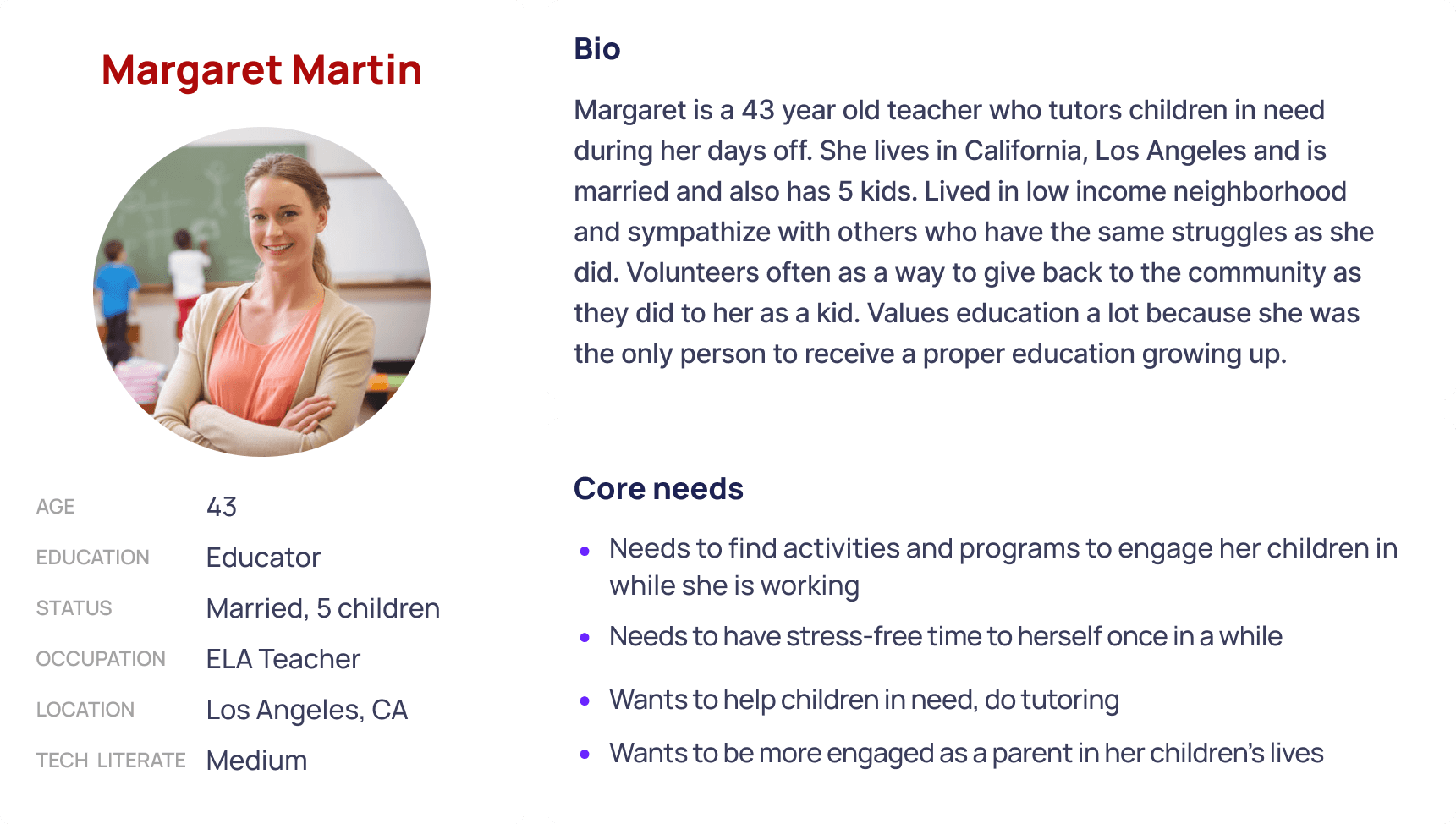
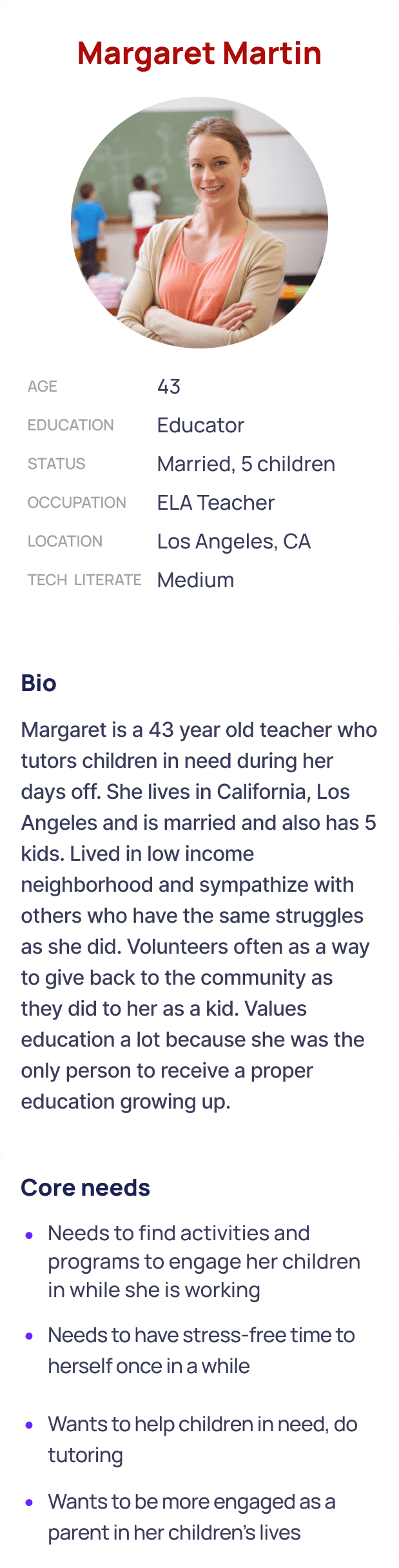
With these questions in mind, we conducted user interviews to see what people thought about the original LISA Academy pages for these sections, and used the responses to create our user persona, Margaret Martin.
2
The Competitors
After determining our user persona, we perused other educational sites with one question:
What would Margaret think?
We wanted to keep Margaret happy, to be able to design a site that would prevent any pain points in finding information for her children.
Our team referenced other websites for educational services in order to make LISA Academy’s website more streamlined, as well as including cleaner formatting and less saturated colors. We especially wanted the news and events section to be kept near the top of the homepage, as parents would most likely want to see this section when visiting the site.


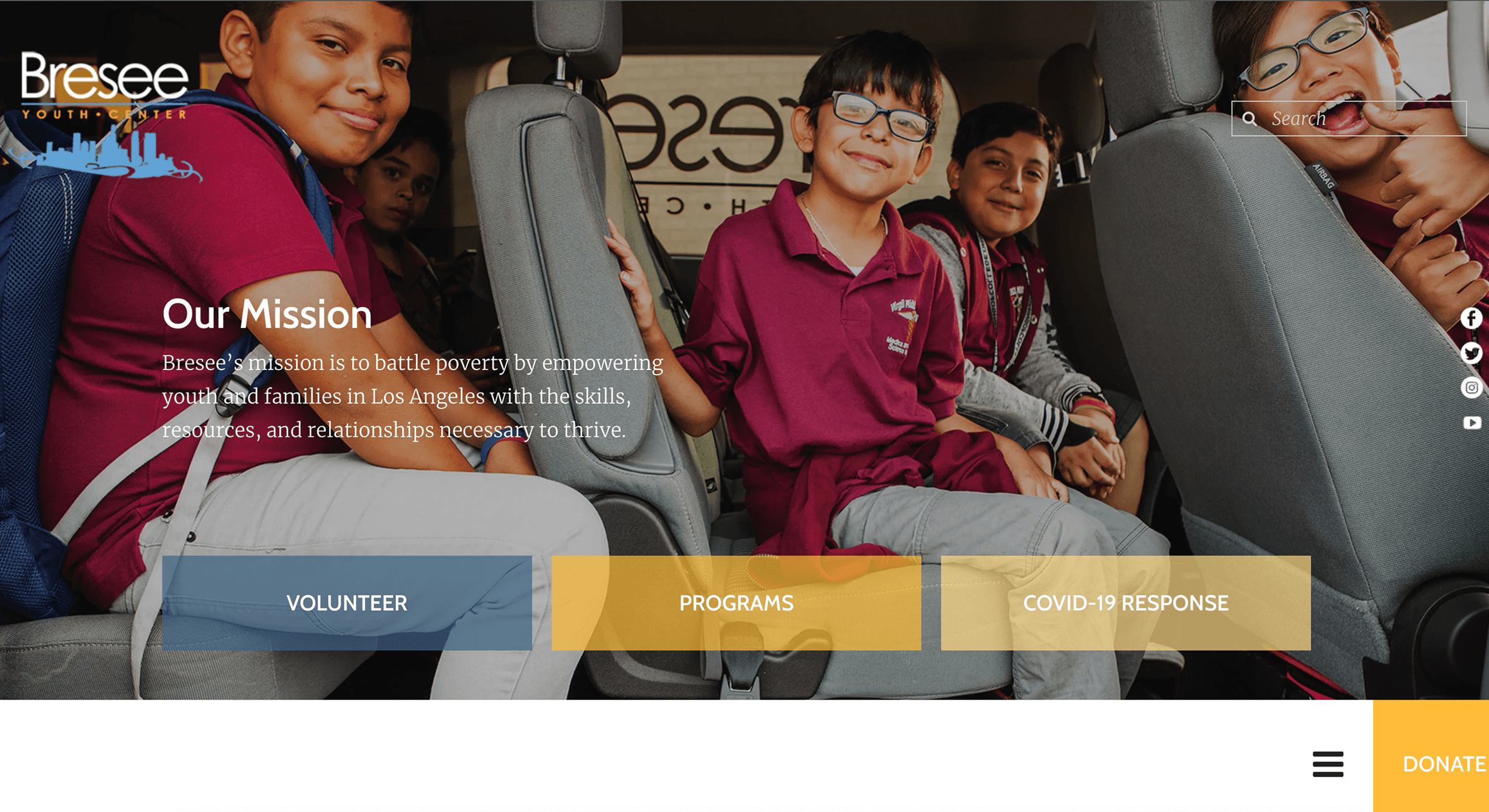

Scroll through all the sites we referenced →
3
The Process
After taking notes on competitors, we created user flows, mapped out the site pages, consolidated our data from the user interviews we conducted. This allowed us to begin our sketching and rough ideations, from which we iterated and revised upon as a team. We ended up with six desktop screens and six mobile screens, prototyped and ready to present.
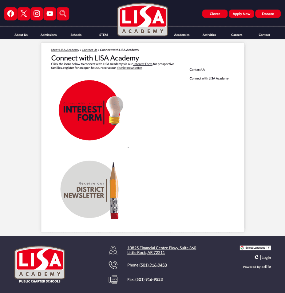


The process that our team went through →
4
The Conclusion
I learned a lot about collaborating with a team and coordinating with a stakeholder during this project. While our stakeholder did not have many requests or expectations, we still provided a timeline for updates and kept in contact with the him. Ultimately, our design was never implemented as implementation was outside our project scope, but it was a valuable experience nonetheless.
One thing I'd focus on in a similar future project is stronger information architecture and visual hierarchy. For the visual hierarchy, I feel that some elements (such as the font sizes and information layouts) were similar in size and value, leaving the user without a clear focal point. In terms of the information architecture, the menus and page information could have been organized into a larger menu that would reduce how much content competes for attention on a single screen, a problem the final design still struggled with.
" transform="translate(25 41) rotate(90 30.75 13.5)" width="61.5px"/></svg>)
" transform="translate(16 7)" width="61.5px"/></svg>)