Some final assets of the project
December 2023
IMPACT
Our team reworked the FDA website, leading to a 42% increase in ease of use for users.
1
Research
Starting out, our team went through some government sites and decided to work on the FDA website. It was a site that needed to communicate massive amounts of information, but navigating the site felt overwhelming as well.
We made our proto-persona, Kevin, a new cafe owner who needed to check the FDA regulations on food to ensure that he was complying with the most recent guidelines. Then we mapped out Kevin's path: he'd probably need to check the Food Safety Modernization Act, FDA Food Allergens, FDA Label Claims, and FDA Inspections and Compliance Page.
So how hard is it to find the right pages?
With this question in mind, we found five participants and gave them three tasks to accomplish.
Find the Federal Food and Drug Regulation page
Find 2022 Food Code
Find registration for importing overseas products
The tasks were related to something that Kevin might search for. We wanted to see how feasible it would be for the average user to find this information on the site. After interviews, we consolidated our data to see what was most difficult for users to complete.
Our testers seemed to struggle the most with Task 1, getting to the Food and Drug Regulations Page, as users would need to read through 5 pages and click on the correct links that lead to the correct page. The deep website hierarchy increased room for error and likely contributed to the lower average score.
In contrast, Task 3 only required users to read and click through 3 pages, which may explain why participants found it significantly more accessible.
This lead us to conclude that the main pain point was the information architecture, which was incredibly deep. This led us to mapping out the current site pertaining to Kevin, and working out how to reorganize such large amounts of information into a flatter navigational structure.
2
Iterations
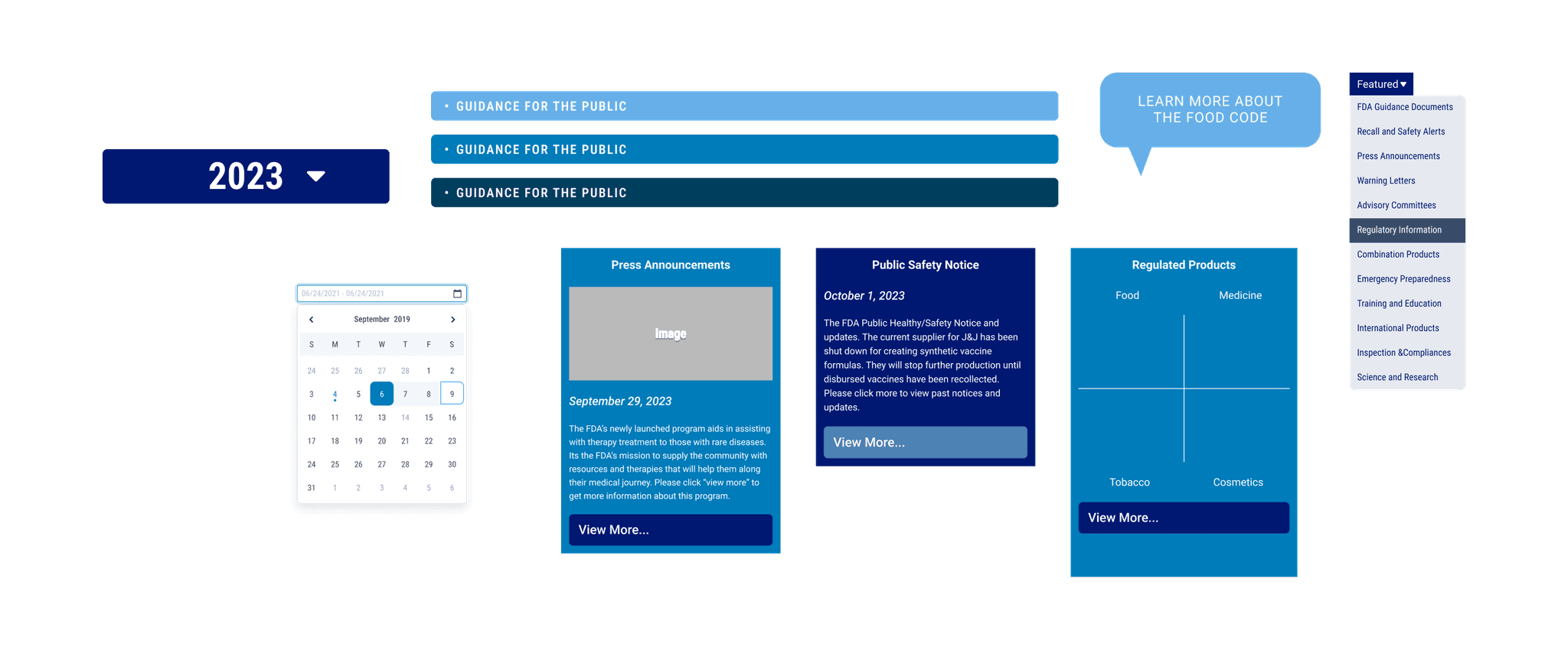
After several rounds of mapping out the current site, and reordering layers to be more simplified for the redesign, we created lo-fi variations of the site, which then turned into hi-fi adaptations.
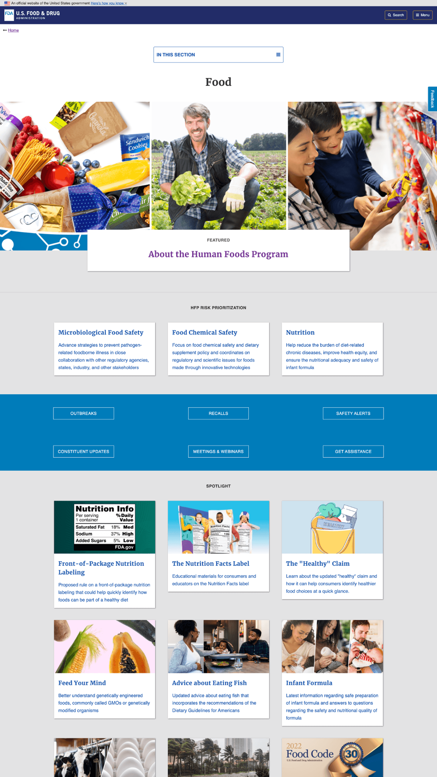
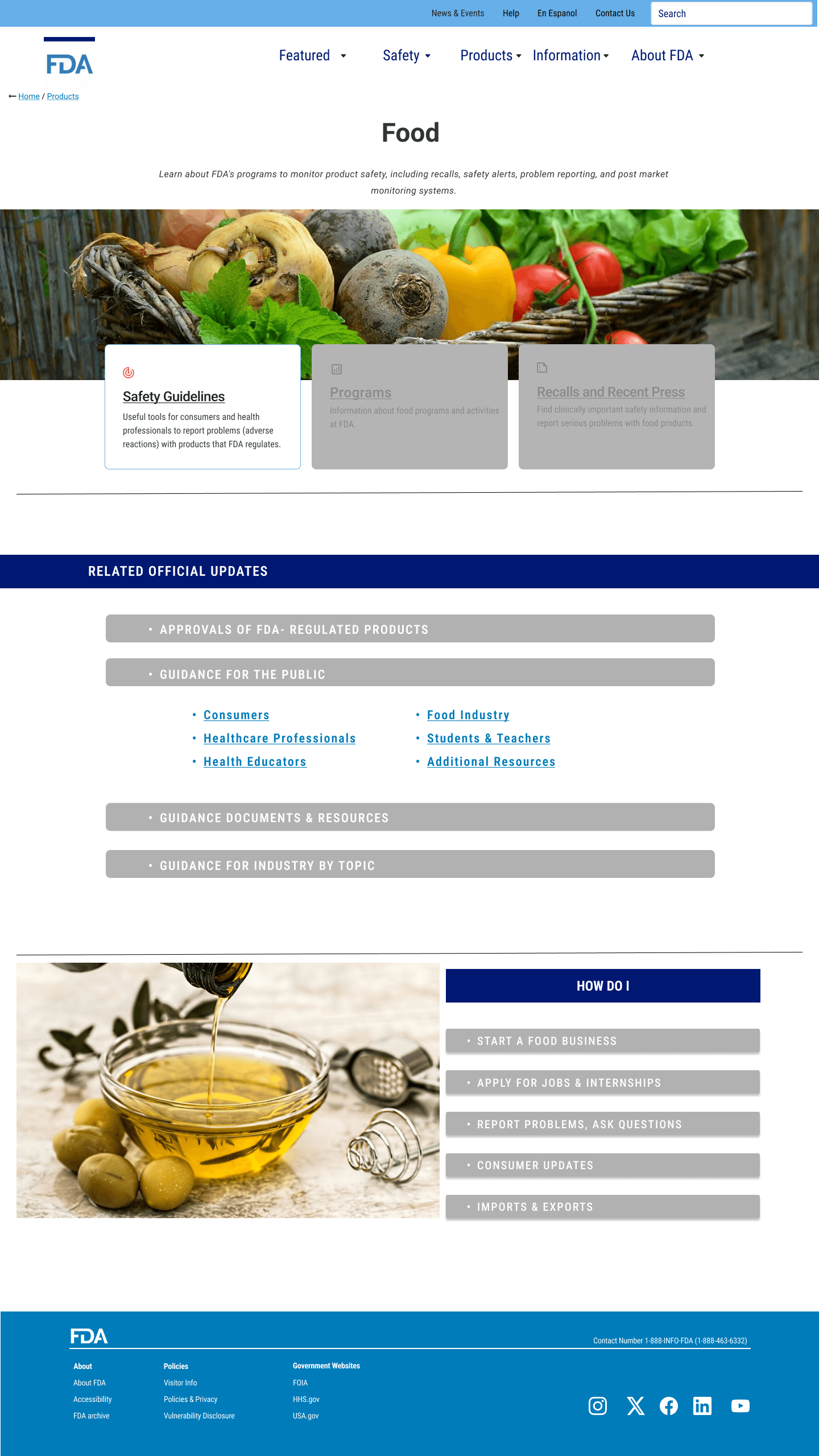
While some of the redesign had unintentionally focused on creating prominence for the Food category based off of our proto-persona, the rest of the testing and design aimed to improve upon user navigation.
We found that in our last trials testing the final design, the average score for Task 1 with the redesign shot up to an average score of 3.5 / 5, which was an improvement compared to the 1.5 /5 at the beginning.
3
The Conclusion
This project was a valuable exercise in understanding how information architecture can make or break a user's experience.
Working within a group setting taught me a lot about navigating differing opinions — it was easy to want to accommodate everyone's ideas, but that often made it harder to land on a clear design direction. If I were to revisit this project, I'd want to conduct more rounds of usability testing with a broader set of participants, clarified research tasks and verbiage, and spend more time stress-testing the redesigned navigation before moving into hi-fi.
That said, seeing Task 1's average score climb from 1.5 to 3.5 out of 5 was a tangible reminder that even small structural changes can meaningfully reduce friction for users.
" transform="translate(25 41) rotate(90 30.75 13.5)" width="61.5px"/></svg>)
" transform="translate(16 7)" width="61.5px"/></svg>)