Some final assets of the project
August 2024 - November 2024
MY IMPACT
Took the design of the project from 0→1.
1
The Visuals
During the first couple weeks, I set out to lay the foundations for the app's look and feel for the pitch deck upon an urgent request by the stakeholders. A couple key considerations at this stage were color psychology and imagery.
I expected that users who would come to the app would likely be looking for comfort and connection with others who share similar experiences. I tried palettes with emphasis on a few different colors: green (nature is found to invoke positive feelings in viewers), blue (calm, trust, stability), and purple (balance and introspection).
A few of the color palettes brainstormed initially.
The second step was determining the visual language; namely, what images would be included. It was important to not have anything that might trigger users, as even having a specific body type can induce negative feelings and comparison.
A softer, more abstract artistic direction allowed the app to remain visually engaging while prioritizing user safety.

↑ The first draft of illustrations
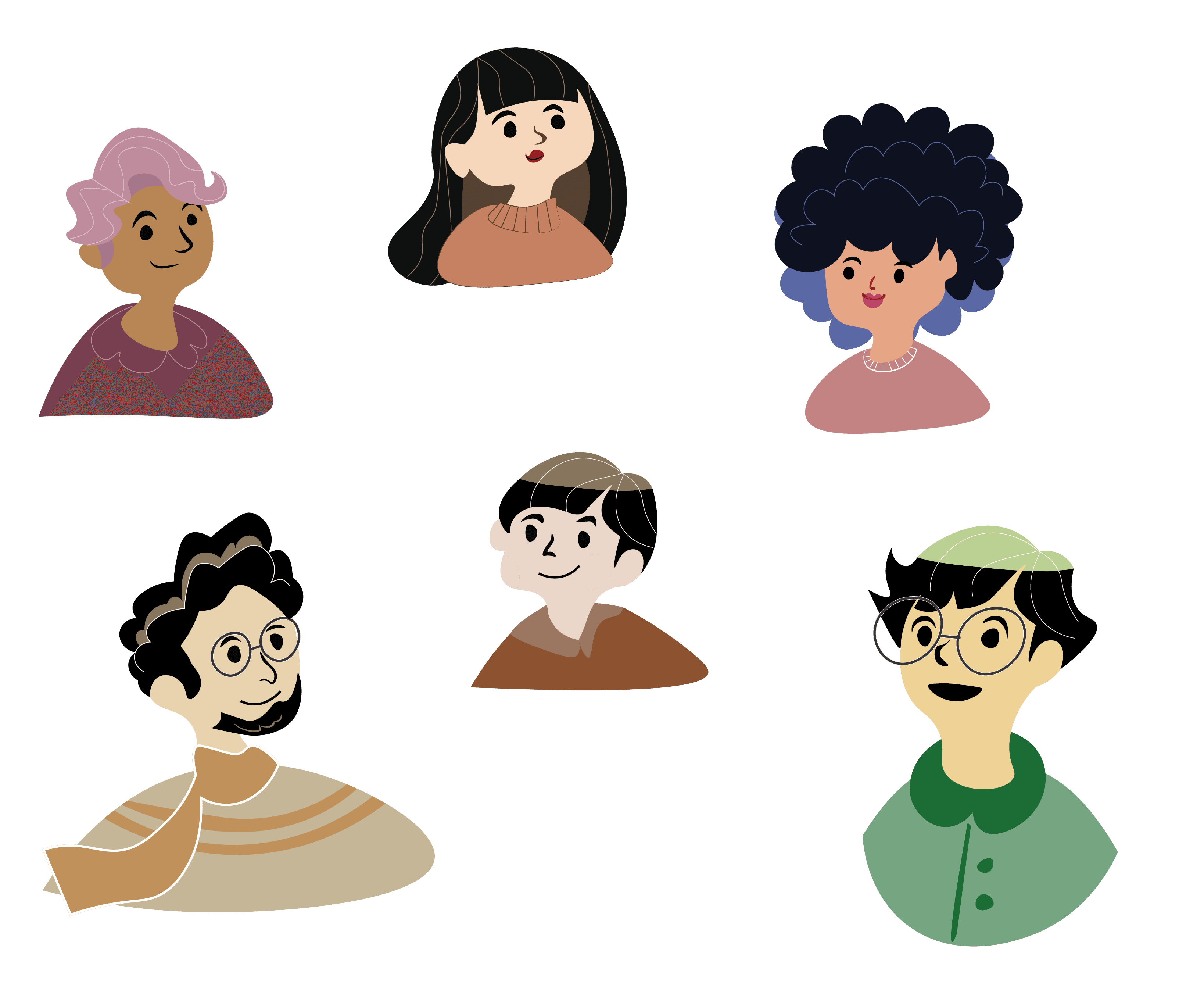
↑ The final draft of illustrations.
2
The UX
After the visual design, it came back to the next question:
The founders had envisioned an online space where people could confide in each other and find community, but is that what users would want? Are there other apps that would fulfill this same need?
Who are the users?
Meet Samuel
With an initial brainstorming session with the founders, who have had personal experiences with eating disorders, I came up with the proto-persona Samuel Hardy.


The ideal user for the app would be someone who was open to connecting with others about their struggles with disordered eating, and who would proactively seek out a community space to talk about these issues.
What would Samuel do?
After creating the proto-persona, I tried to put myself into his shoes and think about what a teenage boy would feel, how he would be limited by his environment.
What are real people experiencing and dealing with?
Imagining Samuel's feelings was good and all, but he wasn't real. I needed some actual data to proceed.
I reached out to people on Discord groups, and was able to attain answers about their experiences with eating disorders from an interview.
They felt that while actively in their disorder, they just wanted to escape their reality.
While it is immensely easier to talk to someone who has had an eating disorder before (since they understand the experience), it might be triggering while actively in their disorder.
There are two main user groups: those who have not had professional treatment and are seeking resources online to manage their disorder, and those who have had treatment and use these apps to reduce cognitive load and as supplementary treatment.
I also referenced Reddit, as the anonymity of the site may allow for some people to be more honest about their struggles (albeit, also with posts and comments that may not be trusted fully). In addition to gathering a little data on what people were saying on Reddit, I was also able to gather how people were able to interact in a discussion board versus an online chatroom.
I also looked for an official source, WebMD, on their articles about dealing with eating disorders and best ways to help others struggling with the illness.
The research showed that the main target audience for the app would work best for people recovering from an eating disorder, and for people who would use it as a resource rather than a main source of treatment. It also pointed out a glaring warning: the app has to discourage comparison, or else it might risk triggering users and exacerbating their disorder.
It's worth noting that the research phase spanned about a week and a half, which limited the depth and breadth of interviews I could conduct. With no incentive offered to participants, recruitment was difficult — those who did respond were self-selecting, which may not fully represent the range of people Commune-ED would serve.
The largest issue was a subscription cycle. While the team wanted this app to be accessible for all ages, including minors, they also wanted to introduce a payment model. It lead to questions such as "Why not just use Reddit or Discord for free?" and "What does our app provide to amount to the cost?".
In the end, the minimal viable product did not have a subscription model in place.
3
The UI
After the research was presented, features and capabilities of the app were decided upon.
I built out the screens for:
1. Login/Sign Up/Create Account
Loading Screens
Chatting with Fred
Joining/exploring chatrooms
Scheduling appointments/meetings
Video calls
Resources
Editing your profile/mentor profiles
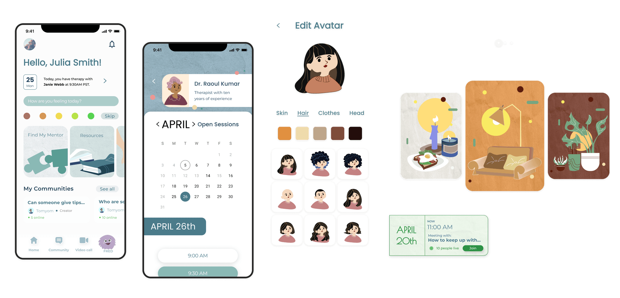
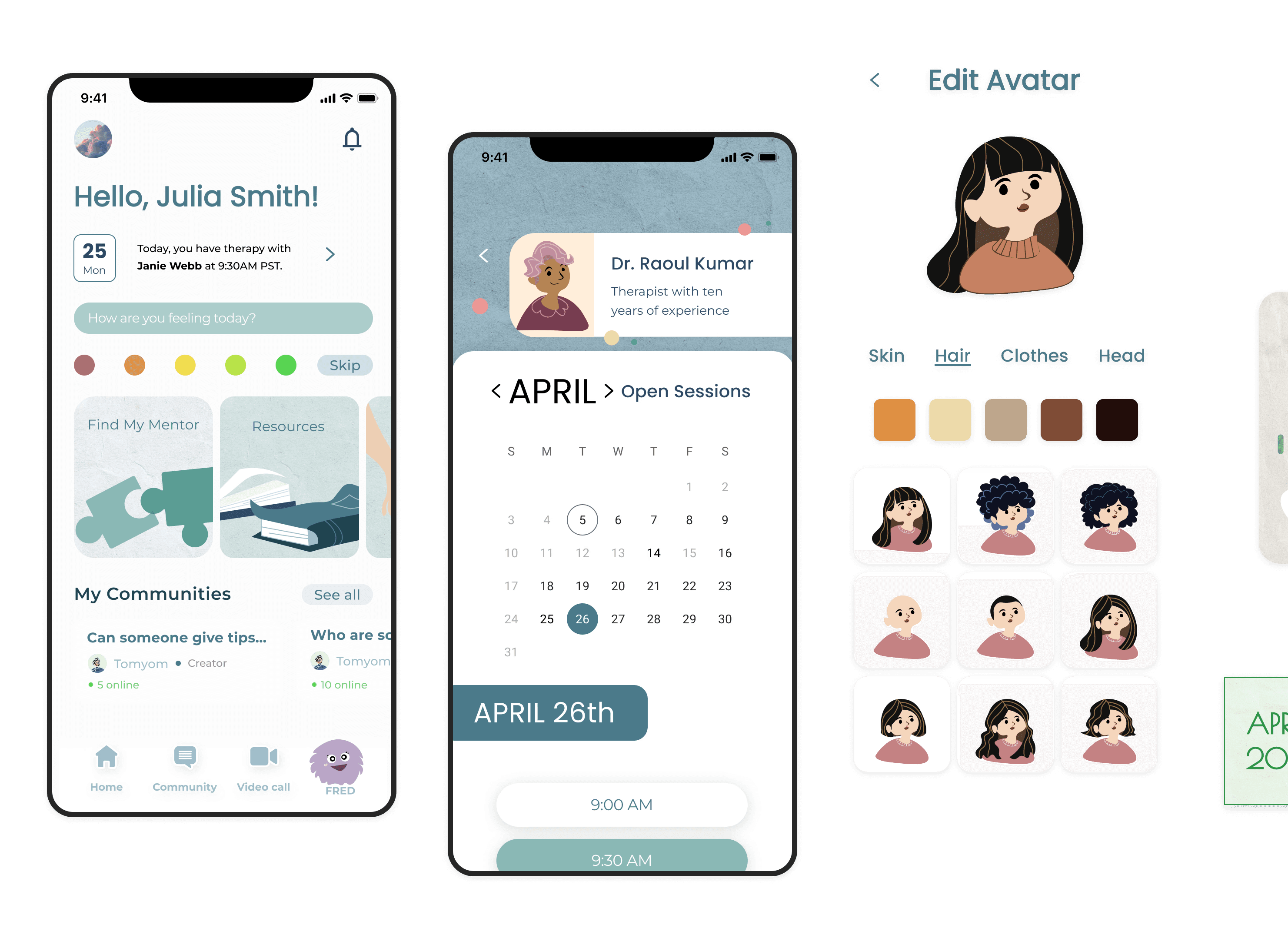
I aimed to promote exploration of groups and rooms, especially for new users, while also keeping saved groupchats easily accessible. I also designed for notification popups of the guardrails set in place for the AI chatbot, and made sure to include a section for resources for people who were unsure of interacting with others just yet.

A part of the intro flow to the app.
Reworks after launch
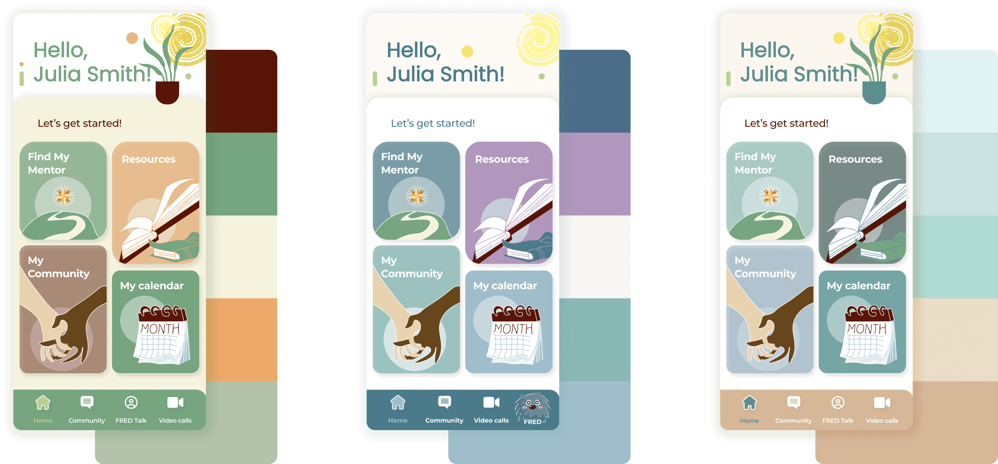
With the release of the MVP on the app store, there has also been user feedback. Users found the dashboard to be confusing and unintuitive, while the rest of the flow such as exploring new groupchats or chatting with Fred went smoothly. With this feedback, I went ahead and did some thinking on what the user needs to see on the homepage.
The user would want to see any upcoming appointments
Notifications from chats or mentors would also be useful
The main navigation sections
Perhaps the main chatrooms that the user is active in
Their profile
From here, I created the dashboard 2.0.

Original dashboard (left) and Dashboard 2.0 (right)
4
The Conclusion
I learned a great deal from this project. This was my first large-scale project where I was brought on as a designer for an app that was intended for release into the market. While I made a few missteps, such as trying to accommodate for everyone's ideas (creating difficulty in coming to a conclusive design) and not getting as many user interviews as I'd like within the week timeframe I had, this project was ultimately an invaluable learning experience for me.
Managing the workflow of an entire project, from conception to finish, was something that I learned on the job. I gained experience on how to balance stakeholder needs with design recommendations, and how to pitch meetings in a more efficient way by presenting refined final ideations based on stakeholder feedback and requests.
Overall, this project taught me that the UX workflow is definitely a lot less structured than it was presented in class. It's similar to research or painting - starting with an idea, then using the UX tools available to iteratively develop and refine it.
" transform="translate(25 41) rotate(90 30.75 13.5)" width="61.5px"/></svg>)
" transform="translate(16 7)" width="61.5px"/></svg>)